Console Table Colours for Dark and Bright Lobbies: Choosing Tones That Stay Balanced
Console table colour choice works best when you start with the lobby itself: how much light it receives and what colour the walls are. This guide shows how to match wood tones and stains to dark and bright entrance spaces.
Console table colour choice is easier when you stop looking at the table alone and start with the room around it. The amount of light in your lobby and the colour of the walls behind the piece will change how any wood tone looks, often more than the stain itself. This guide gives hotel owners, designers and procurement teams a practical way to decide colour before a sample is made.
Why the Lobby Should Set the Colour, Not the Catalogue
A stain card or a showroom photo is seen under neutral light, against a neutral background. A hotel lobby is rarely like that. Daylight from a glass facade, warm spotlights, dark stone floors and painted feature walls all alter how a finish is perceived.
For this reason, we suggest working backwards. First describe the space, then choose a tonal direction, and only then pick the exact stain. This approach reduces the risk of approving a colour that looks right on paper but feels wrong once installed.
Step 1: Assess Room Brightness
Before discussing wood tone selection, classify the lobby into one of three groups. You can do this with a simple site visit or by reviewing the lighting design.
- Bright lobby: large windows or glazed entrances, light floors, plenty of natural light during the day.
- Dark lobby: few or no windows, dark stone or timber floors, mostly artificial lighting.
- Mixed lobby: bright by day near the entrance, but darker toward the lifts or corridors.
Check the lobby at different times of day if the building already exists. For a new build, ask the lighting designer for the planned colour temperature, since warm and cool light shift wood colour in different directions.
Step 2: Read the Wall Colour Behind the Table
A console table sits against a wall, so the wall is its immediate background. The contrast between the two decides whether the piece stands out, blends in or looks heavy.
Light walls (white, cream, pale grey)
Mid to dark wood tones create a clear outline on light walls. A very pale finish can look washed out and lose definition. If you want a soft, airy look, keep some grain visibility so the piece still has depth.
Mid-tone walls (taupe, sage, warm grey)
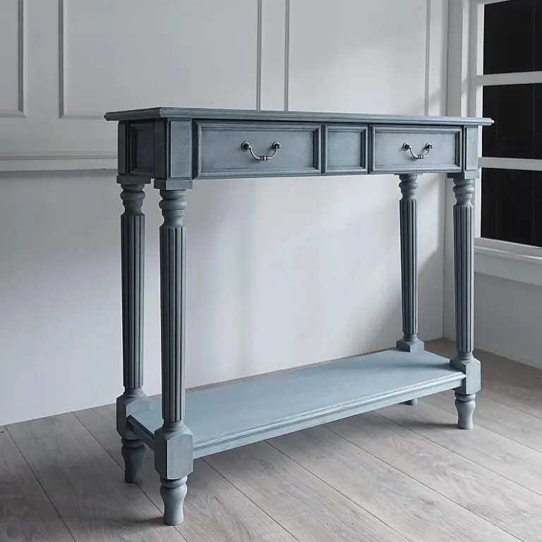
These walls are the most demanding, because a mid-tone table can disappear into them. Choose either a noticeably lighter or a noticeably darker tone, rather than a close match.
Dark walls (charcoal, deep green, navy, dark panelling)
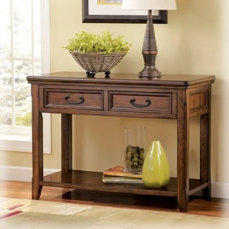
Dark walls absorb light. A dark console on a dark wall can read as a shadow, so many designers use a medium or lighter wood, or add contrast through a stone top or a metal detail. If tone-on-tone is the intention, the grain and the finish sheen need to carry the interest.
Colour Direction for Dark Lobbies
In a dark lobby, the console table has to work harder to be seen. Very dark finishes can absorb what little light there is, leaving the piece looking flat and making dust and marks harder to judge.
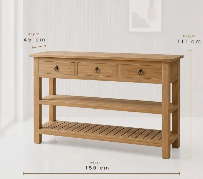
- Choose medium or warm natural tones, such as natural oak or a lighter walnut look, to lift the area.
- Prefer satin over matt if you want the surface to catch light gently, but avoid high gloss, which can produce hard reflections from spotlights.
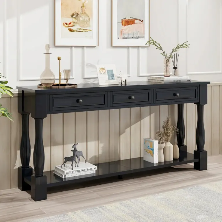
- If the brand calls for a dark finish, keep the grain visible with open-pore or semi-transparent stain, so the piece has texture instead of a solid black mass.
- Consider integrated lighting or a nearby wall light so the table is not lost in the shadow.
Colour Direction for Bright Lobbies
Bright lobbies are more forgiving, but they bring their own issues. Strong daylight can make light finishes look bleached and can highlight colour differences between boards or veneer sheets.
- Medium and deeper tones provide a grounding element in a space full of light.
- Light natural finishes work well, but ask for a sample checked in daylight, because pale tones shift most under strong sun.
- Direct sunlight can fade some finishes over time. If the console sits near a glazed entrance, discuss UV-resistant coatings with your manufacturer.
- Matt and satin finishes reduce glare and hide small scratches better than gloss in bright settings.
A Quick Selection Matrix
| Lobby condition | Wall colour | Suggested tonal direction | Watch out for |
|---|---|---|---|
| Dark lobby | Dark | Medium or lighter wood, or contrast top | Table disappearing into the wall |
| Dark lobby | Light | Warm medium tones | Flat look without accent lighting |
| Bright lobby | Light | Medium to dark wood for definition | Pale finishes looking washed out |
| Bright lobby | Dark | Mid or deep tones with visible grain | Glare on glossy surfaces |
| Mixed lobby | Mid-tone | Clearly lighter or darker than the wall | Colour shifting between zones |
Treat this table as a starting point, not a rule. Floor colour, ceiling height and other furniture will all influence the final decision.
Undertone Matters as Much as Depth
Two finishes of similar darkness can feel very different because of undertone. Warm browns with red or yellow notes add comfort to cool, stone-heavy lobbies. Cooler, greyer browns suit contemporary spaces with white or grey palettes.
When you choose a stain colour for a hotel, compare it with the floor and the main upholstery, not only the wall. A mismatch in undertone between the console and a nearby timber floor is a common reason a lobby feels unresolved.
How to Approve Colour Properly
Even a well-reasoned decision needs physical confirmation. We recommend the following process for any custom order:
- Share the wall colour reference (RAL, NCS or a paint chip), the floor material and a lighting description with the factory.
- Request finish samples on the actual wood species or veneer, since the same stain looks different on oak, walnut or ash.
- View the samples on site, against the real wall, at more than one time of day.
- Confirm the sheen level together with the colour, because gloss changes perceived depth.
- Sign off a reference sample that the factory keeps for batch comparison during production.
This last step is especially important for larger orders, where consistency across many pieces matters as much as the original colour.
Common Mistakes to Avoid
- Choosing from a screen image, where display settings alter colour.
- Approving a sample under showroom lighting only.
- Matching the console too closely to the wall tone.
- Ignoring sheen level when comparing finishes.
- Forgetting that natural timber varies from board to board, so a small tolerance range should be agreed in advance.
Working with Palmiye on Colour
We produce custom console tables to project drawings in our factory in Istanbul and supply hotel projects worldwide. When you send us your lobby drawings, wall colour references and lighting notes, we can propose tonal directions and prepare finish samples for approval before production starts. Timing and cost depend on the species, finish system and quantity, so we confirm these once we see your project details.
Conclusion
The right console table colour choice begins with the lobby: how bright it is, what colour the walls are and how the lighting behaves across the day. Define those conditions first, select a tonal direction, then approve a real sample on site. If you are planning a hotel project, send us your drawings or a short brief and we will help you shortlist finishes that stay balanced in your space.
Sıkça Sorulan Sorular
How do I choose a console table colour for a dark hotel lobby?
Start with the wall colour. In a dark lobby, medium or warm natural wood tones usually lift the space better than very dark finishes. Add a satin sheen and accent lighting so the piece does not disappear. Always check a finish sample on site before approving production.
Should a console table be lighter or darker than the wall?
It should be clearly different, either lighter or darker, so the piece has a defined outline. A table that closely matches a mid-tone wall tends to blend in and look flat. If you want a tone-on-tone effect, rely on grain and finish sheen to add interest.
Does lighting change how a wood stain looks in a lobby?
Yes. Warm light emphasises red and yellow notes, while cool light makes browns look greyer. Daylight also reveals colour variation more than spotlights. For this reason, view samples under the actual lobby lighting and at different times of day.
Can the factory match my paint reference or wall colour?
We can prepare finish samples based on your references, such as RAL or NCS codes for lacquer, or a physical sample for wood stains. Natural timber varies, so matches are made within an agreed tolerance and confirmed through an approved reference sample.
Will sunlight fade a wooden console table near the entrance?
Strong, direct UV light can change some finishes over time, especially lighter or heavily pigmented ones. If the console sits near a glazed entrance, discuss UV-resistant coating options with your manufacturer and consider the position of blinds or glazing treatments.
Every hotel project is different. Send us your drawings or room schedule for a tailored proposal on materials, lead time and shipping.