Console Table Colour Trends by Region: Light Oak in Europe, Dark Walnut in the Gulf
Colour preferences for wooden console tables vary by market, climate and hotel type. This guide maps common tone choices to export regions so you can align a custom range with local taste.
Console table colour trends differ noticeably from one export region to another, and the finish you choose often matters more to guests than the exact model. A pale, natural oak that feels fresh in a Scandinavian-influenced city hotel can look out of place in a Gulf lobby that expects depth and richness. This guide maps tone preferences to regions so you can align a console range with local taste before you brief the factory.
The patterns below are general observations from hospitality projects, not statistics. Every hotel brand, designer and climate is different, so treat them as a starting point for your own specification and always approve a physical sample.
Why colour preferences vary by region
Several factors shape which wood tones feel right in a market:
- Light and climate: strong sunlight and bright interiors tolerate darker tones, while grey northern light often favours lighter, warmer woods.
- Design heritage: Nordic, Mediterranean, Arabic and Central Asian interiors each carry their own traditions of wood, ornament and contrast.
- Hotel positioning: a business hotel, a beach resort and a heritage property rarely share the same palette.
- Surrounding materials: marble, stone, brass, textiles and flooring all influence which console tone looks balanced.
Europe: light oak, natural tones and soft contrast
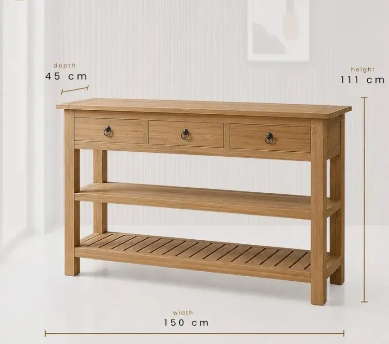
In many European markets, designers lean towards light and mid-tone oak, ash and natural-looking finishes. Matt or low-sheen oils and lacquers that keep the grain visible are common, often paired with pale walls, linen textiles and black or brushed metal details. The overall mood is calm, tactile and understated.
Within Europe there is still variety. Northern and Western European projects often favour pale, slightly cool or neutral oak. Southern European resorts may prefer warmer honey tones or whitewashed effects that suit coastal light. Smoked or darker oak appears in urban boutique hotels that want a more dramatic lobby.
Practical notes for European orders
- Light finishes show grain and veneer matching clearly, so material quality and sequencing become visible.
- Pale tones can reveal dirt and wear differently from dark ones; discuss finish choice with the operator.
- Ask for documentation on timber origin and finishes if the buyer or brand requires it.
Gulf and Middle East: dark walnut, depth and glossy detail
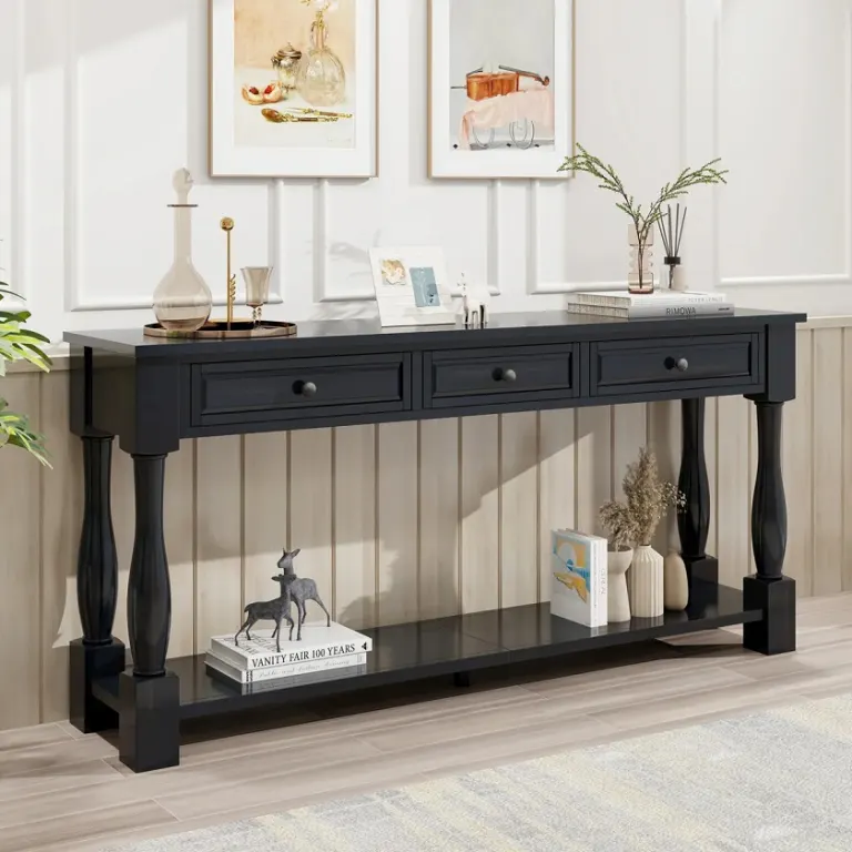
In the Gulf region, many hotel interiors favour deeper tones such as dark walnut, espresso and rich brown, frequently combined with marble, brass or gold-toned metal and a more polished finish. The look suggests warmth, formality and luxury, especially in lobbies, suites and ballroom foyers.
That said, contemporary Gulf projects increasingly include lighter, warmer woods and layered neutrals, particularly in lifestyle and resort brands. Do not assume that every client wants the darkest option; the brand standard and the designer's concept should lead.
Practical notes for Gulf orders
- High-gloss and dark finishes show fingerprints and scratches readily, so ask about protective coatings and cleaning guidance.
- Strong daylight near glazed entrances can influence how colours age, which is worth discussing for exposed locations.
- Check how the sample looks under the actual lobby lighting, not only in daylight.
Central Asia: warm mid-tones and classic richness
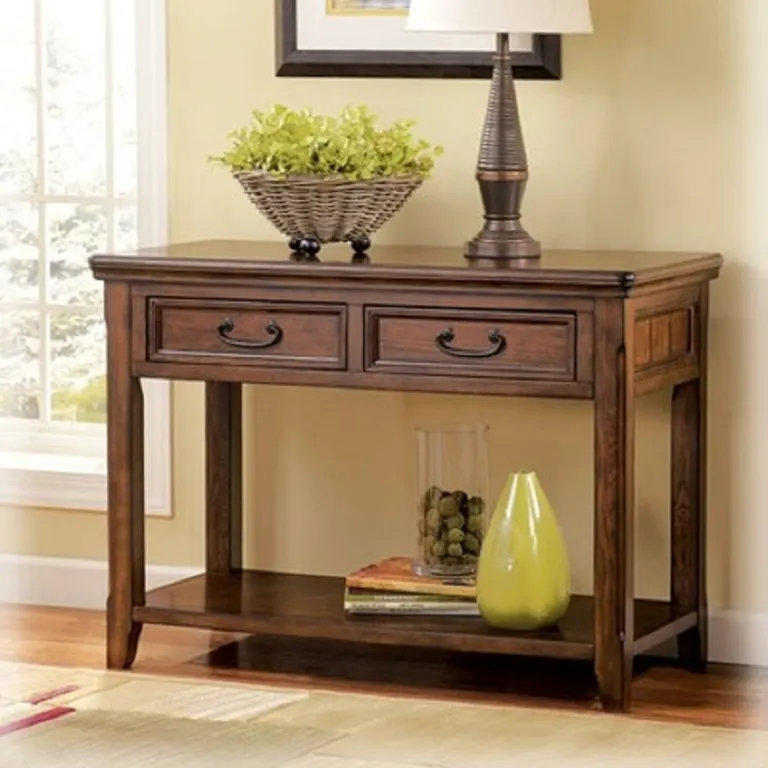
Hotel projects in Central Asia often combine a taste for warm, mid-to-dark wood with classic or neo-classical detailing, though modern international brands bring more neutral palettes to city hotels. Cherry-like reds, warm walnut and medium browns are frequently requested for traditional-leaning interiors, while contemporary projects mirror European tones.
Because requirements vary widely between a branded city hotel and a locally owned property, ask the designer for reference images and finish codes rather than relying on regional generalisations.
Africa: warm timbers, durability and climate
African hospitality projects span coastal resorts, safari lodges and urban business hotels, so a single colour direction does not exist. Warm, earthy tones such as natural teak-like browns, mid walnut and honey shades are popular in lodges and resorts, while city hotels often follow international brand palettes.
Climate matters as much as taste here. Humidity and heat can affect finishes and timber behaviour, so durability, moisture control and protective coatings deserve as much attention as shade.
Other markets: Asia, the Americas and Australia
For buyers in Asia, the Americas and Australia, the same logic applies: start with the brand standard and the designer's palette, then adjust for light, climate and local expectations. Asian resorts often favour natural, light-to-mid woods with a calm, spa-like mood, while urban luxury hotels may choose darker, more contrasted tones. In the Americas and Australia, brand design books frequently dictate finish families across entire portfolios.
Regional tone overview
| Region | Commonly requested tones | Typical finish feel | Points to check |
|---|---|---|---|
| Europe | Light and mid oak, ash, smoked oak accents | Matt or satin, visible grain | Veneer matching, wear visibility |
| Gulf and Middle East | Dark walnut, espresso, rich brown | Satin to high gloss | Fingerprints, light exposure |
| Central Asia | Warm mid-tones, walnut, cherry-like shades | Classic, semi-gloss | Reference finish codes |
| Africa | Warm honey, teak-like and walnut browns | Satin, protective coatings | Humidity, heat, durability |
| Asia, Americas, Australia | Varies: natural light woods to dark contrast | Brand-driven | Design book compliance |
How to align a console range with local taste
If you supply several markets or manage a chain, work through these steps before finalising the range:
- Define a core finish family. Choose two or three base tones that suit your brand and can be adapted by region.
- Adapt, do not rebuild. The same console model can often be offered in a light oak and a dark walnut version without changing construction.
- Check the wood species. Some tones are easier to achieve on certain species, and staining can look different on oak, ash and beech.
- Test under real lighting. Colour changes under daylight, warm LEDs and cool lighting, so approve samples in a representative setting.
- Document the approved sample. Keep a signed sample and finish reference so reorders and later batches can be matched.
Wood stain trends in hotels: what is changing
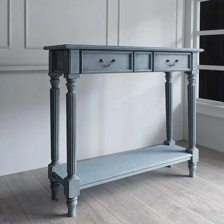
Across regions, designers are moving away from heavy orange-toned finishes towards more natural, slightly desaturated colours. Warm greys, soft browns, smoked effects and visible grain are all part of current wood stain trends for hotels, while fully opaque painted looks appear in selected projects. Textured and fluted surfaces also change how colour reads, since grooves create natural shadow and depth.
Trends move faster than a hotel's refurbishment cycle, so consider choosing a tone that supports the brand for several years rather than reacting to the newest look.
Working with a factory on colour
Colour is subjective, and words such as honey, ash or espresso mean different things to different people. We recommend sending finish references, physical swatches or RAL and Pantone-style codes where relevant, along with photos of the intended setting. We then prepare finish samples on the actual species so you can compare tone, grain and sheen before production.
Small variation between natural timber pieces is normal, and a clear sample approval process helps everyone agree on what is acceptable across a large order.
Conclusion
Console table colour trends follow region, climate and hotel positioning, but the best choice is always the one that fits your brand, your lighting and your guests. Use the regional patterns here as a briefing aid, then confirm with samples. If you are planning a console range for one market or several, send us your drawings, references or room schedule and we will suggest suitable species, finishes and a sampling plan for your project.
Sıkça Sorulan Sorular
Which console table colours are most popular in European hotels?
Light and mid-tone oak, ash and natural-looking finishes with visible grain are widely requested in Europe, often in matt or satin sheens. Smoked oak appears in urban boutique projects. Preferences still depend on the brand, designer and location, so confirm your direction with a physical sample.
Is dark walnut always the right choice for Gulf hotels?
No. Dark walnut and rich browns are common in Gulf lobbies and suites, but many contemporary projects now use lighter, warmer woods and layered neutrals. The brand standard and the designer's concept should guide the choice rather than a regional assumption.
Can the same console table model be made in different finishes?
Usually yes. A model can often be produced in a light oak and a dark walnut version without changing its construction. Some tones work better on certain species, so we recommend agreeing the wood species and finish together and approving a sample.
How do I make sure the colour matches my design intent?
Provide finish references, physical swatches or colour codes and photos of the setting. The factory then prepares samples on the actual species. Check them under the lighting used in the hotel and keep the approved sample for reference during production and future reorders.
Do wood colours look different under hotel lighting?
Yes. Daylight, warm LEDs and cool lighting can all change how a stain reads, especially on grain and undertones. Review samples in conditions similar to the final space, ideally at the times of day when the area is used most.
Every hotel project is different. Send us your drawings or room schedule for a tailored proposal on materials, lead time and shipping.