Console Table Wood Colour Names: Translating Words Like Honey, Ash Grey and Espresso into Real Finishes
Words like honey, ash grey and espresso are useful for mood, but a factory cannot produce a finish from a name alone. This guide shows how to convert colour vocabulary into specifications you can approve and reorder.
Wood finish colour names such as honey, ash grey or espresso are shorthand for a mood, not a formula. One designer's honey is a pale golden oak; another's is a deep amber. If you send only a name to a factory, you are leaving the result to interpretation, and that is where colour disputes on hotel projects usually begin.
This article explains what is hidden behind common colour words and how to turn them into information a manufacturer can actually work with. It is written for buyers ordering custom console tables from overseas, where you cannot simply walk into the workshop and point at a panel.
Why colour names fail in specifications
A colour name describes the result a person imagines. A finish, by contrast, is the product of several separate decisions made in the workshop. Two pieces can both be called espresso and look quite different.
Four things shape the final colour, and none of them is contained in the name:
- The timber or veneer species: oak, walnut, ash and beech take stain very differently because of their pores, tannins and natural tone.
- The colouring system: a penetrating stain, a pigmented oil, a tinted lacquer or a toner sprayed between coats each give a different depth and transparency.
- The topcoat and gloss level: matte, satin and gloss coatings change how dark or saturated a colour appears.
- Lighting and viewing conditions: daylight, warm hotel lighting and LED spotlights all shift the perceived tone.
Language adds another layer. A name that feels obvious in one market may carry a different meaning in another, which matters when you supply hotels in several regions.
What common colour words usually mean
The descriptions below are general tendencies, not standards. Treat them as a starting point for a conversation, never as a finished brief.
Honey
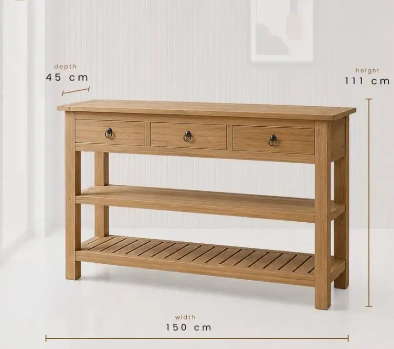
Honey usually points to a warm, yellow-to-amber tone on a light timber such as oak or ash. The key questions are how much red or orange you want and whether the grain should stay visible. A honey oak colour on an open-pore oil finish looks natural and slightly matte, while the same tone under a tinted lacquer looks more uniform and polished.
Ash grey
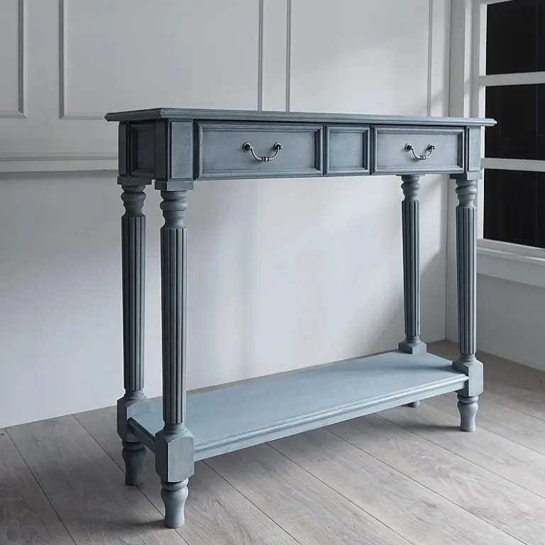
Ash grey describes a cool, desaturated tone, often a washed or greyed timber look. It is one of the harder colours to repeat, because the grey must sit on top of the wood's own warm undertone. Some timbers turn slightly greenish or pinkish when greyed, so a sample on the real species is essential.
Espresso
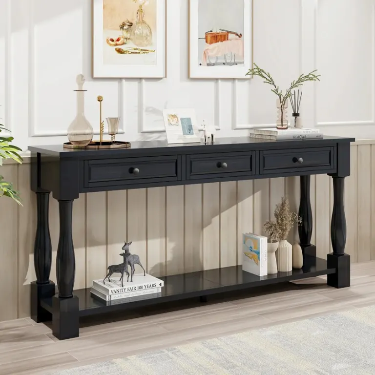
An espresso wood finish suggests a very dark brown, close to black but warmer. The main decision is transparency: do you want the grain to show through, or a solid, opaque dark surface? Very dark finishes also show dust, fingerprints and scratches more easily, so discuss the gloss level and topcoat hardness with the factory.
Other frequent terms
- Natural: usually means little or no added colour, only a clear or lightly toned protective coat. The species itself defines the result.
- Smoked: a darkened tone, produced either by fuming or by stain. Ask which method you are expecting.
- Walnut tone: may mean real walnut or a stained alternative. Clarify which one.
- Cognac, chestnut, mocha: mid-to-dark warm browns with no common definition. They need references.
The vocabulary gap: from name to specification
The practical goal is to move from a subjective word to a set of objective references. The more of these you provide, the closer the first sample will be.
Step 1: State the base material
Name the species and whether the surface is solid wood or veneer. If the console table has both, for example a solid frame and a veneered top, say so, because the two parts absorb colour differently and may need separate adjustment to look matched.
Step 2: Add a physical or digital reference
A reference can be any of the following, listed from most to least reliable:
- A physical sample or finish chip from a previous project or from the project's design package.
- A colour code from a recognised system, such as RAL or NCS, for opaque or tinted lacquers. Wood stains do not usually have such codes, so this works best for painted or solid colours.
- A well-lit photograph taken in daylight, with a neutral grey or white card in the frame.
- A mood board image, which is useful for atmosphere but the least precise for matching.
Remember that a screen shows colour differently from print and from real timber, so a photo should support a sample, not replace it.
Step 3: Define the finish type and gloss
Write down whether you want an oil, a matte lacquer, a satin lacquer or something else. Gloss level changes perceived colour more than most buyers expect. If the finish must hide daily marks in a busy lobby, say so, because it influences both the coating system and the recommended tone.
Step 4: Describe the grain and character
Tell the factory whether you want a clean, even look or visible natural variation. Words such as "rustic", "clean" and "uniform" help the finishing team decide how selectively to choose and sort boards or veneer sheets.
Step 5: Explain the setting
Mention the lighting, the wall colour and the floor around the piece. A tone that works against pale walls may look heavy against dark panelling. This context helps the factory suggest adjustments before you commit.
A simple colour brief table
Use a structure like the one below when you write to a manufacturer. It replaces a single word with a short, complete description.
| Item | Weak brief | Useful brief |
|---|---|---|
| Colour name | Honey | Honey, warm golden tone, slightly less orange than the attached chip |
| Material | Oak | Oak veneer top, solid oak legs, same tone on both |
| Finish | Natural look | Matte lacquer, open-pore feel |
| Reference | Picture from the internet | Physical chip plus daylight photo with a grey card |
| Setting | Hotel lobby | Warm LED lighting, pale stone floor, mid-grey walls |
Why a sample is still essential
Even a detailed brief is a hypothesis until you see the finish on the real timber. For orders placed from abroad, we recommend approving a finish sample on the same species and in the same construction as the final piece. Look at it in daylight and under the lighting that will be used in the hotel.
Keep the approved sample sealed and labelled. It becomes the benchmark for the whole production batch and for any reorders. If you later need additional pieces, a reference sample is far more reliable than a name written in an old email.
Keeping colour consistent across a large order
Natural timber varies from board to board, so a finish will never be identical on every piece. What you can control is the acceptable range. Agree with the factory on what variation is normal for the chosen species, and whether pieces that will stand side by side, such as a pair of consoles in one corridor, should be sorted and finished together.
Record the finish details after approval: species, colouring method, topcoat type, gloss level and any special steps. This record is what lets a factory repeat the colour months or years later.
Common mistakes to avoid
- Approving a colour from a screen image only.
- Using the same colour name for different species and expecting identical results.
- Changing the gloss level after the colour is approved.
- Forgetting that solid wood and veneer parts may need separate tuning to appear matched.
- Not keeping a physical reference after sample approval.
Next step
If you have a colour name, a mood board or a photograph for your console tables, send it to us together with your drawings and the species you have in mind. We will help you translate it into a clear finish description and prepare a sample for approval before production begins. You are welcome to request a project quotation at any stage.
Sıkça Sorulan Sorular
Can a factory match a wood colour from a name like honey or espresso alone?
Not reliably. Colour names are subjective and vary between people and regions. A factory needs the species, finish type, gloss level and ideally a physical sample or chip. With these references, the first sample is much more likely to be close to what you imagined.
What is the best way of describing wood colour to a factory?
Combine several references: the base species, a physical finish chip or previous sample, a daylight photograph with a grey card, the preferred gloss level and a note about the lighting in the space. A short written description of grain character helps as well.
Do RAL or Pantone codes work for wood finishes?
They work well for opaque lacquers and tinted solid colours. For transparent stains on real timber, the result depends on the species and grain, so a code is only a guide. A finish sample on the actual wood is still needed for approval.
Why does the same colour look different on oak and walnut?
Each species has its own natural undertone, pore structure and absorption. The same stain therefore lands differently on each. This is why a honey or ash grey tone should always be sampled on the exact timber or veneer chosen for the project.
How do I keep the colour consistent if I reorder console tables later?
Keep the approved physical sample and a written record of species, colouring method, topcoat and gloss level. Share these with the factory when reordering. Small natural variation between batches is normal, so agree on an acceptable range in advance.
Every hotel project is different. Send us your drawings or room schedule for a tailored proposal on materials, lead time and shipping.